


Hello and welcome to this tutorial on Mastering Normally Distributed, Random Numbers, using Python and NumPy. Here we will will be exploring how to utilize NumPy for generating these Probability distributions.
Probability distributions are mathematical functions that provide the likelihood of various potential results in a particular experiment.
These distributions form the backbone of statistics and data science, allowing us to make meaningful insights from the data. Among them, is normal distribution, also known as the Gaussian distribution, which stands out for its ubiquity in the natural and social sciences.
The normal distribution is a continuous probability distribution characterized by a symmetrical, “bell-shaped” curve.
Mean, Median & Mode
The mean, median, and mode (of a normally distributed, random variable) are equal and located at the peak of the distribution’s curve.
For those unfamiliar with these three terms, here is definition of the mean, median and mode:
Definition of the Mean
The mean, (also known as the average), is calculated by adding all the numbers in the dataset and then dividing by the quantity of numbers. For a normally distributed random variable, it is the expected value or average outcome.

The plot above shows a normal distribution of a dataset (represented by the histogram and the black curve), along with its mean (represented by the red dashed line).
The mean (μ), also known as the average, is a measure of the central tendency of a dataset. It is calculated by adding all the numbers in the dataset and then dividing by the quantity of numbers. In a normal distribution, the mean is the peak of the distribution and represents the most likely value (i.e., the value that a random variable is most likely to assume).
Remember, for a normally distributed random variable, the mean is the expected value or average outcome.
Definition of the Median
The median is the middle number found in a sorted list of numbers.
- If the list has an odd number of observations, the median is the middle number.
- If the list has an even number of observations, the median is calculated as the average of the two middle numbers.
In a normal distribution, it is the point at which half the observations are above and half are below
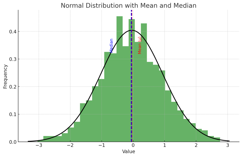
The plot above now includes the median of the dataset (represented by the blue dashed line), in addition to the mean (represented by the red dashed line).
The median is another measure of central tendency, which is the value separating the higher half from the lower half of a data sample. For a normally distributed dataset, the mean and the median are equal and both represent the peak of the distribution.
As you can see, for this dataset, the mean and median lines overlap because the distribution is symmetric, which is a characteristic of a normal distribution.
Definition of the Mode
The mode is the number that occurs most frequently in a dataset. In a normally distributed random variable, it is the most likely outcome or the peak of the distribution’s curve.
In a perfectly normal distribution, the mode is the same as the mean and median.
The mode is the most frequently occurring value in a dataset. However, with continuous data, it’s very unlikely to have exactly the same value appear more than once, so the mode isn’t really a meaningful statistic.
In other words, every value could be unique and therefore occurs only once, so they would all be the mode, which isn’t helpful. That being said, in the context of probability distributions like the normal distribution, the mode is the value at which the distribution reaches its peak. For a normal distribution, this is the same as the mean and median.

The plot above shows a normal distribution of a dataset (represented by the histogram and the black curve), along with its mean (represented by the red dashed line), median (represented by the blue dashed line), and mode (represented by the orange dashed line).
In this case, the mode is defined as the value at the peak of the histogram, where the highest value exists. Note that this is not necessarily the same as the peak of the smooth curve representing the normal distribution. This discrepancy is due to the fact that the histogram is a discrete approximation of the underlying distribution, and its peak can vary depending on the chosen bin size.
As you can see, for this specific realization of the dataset, the mean, median, and mode are close to each other, but not exactly the same. This is a common situation in real-world datasets, even those that are approximately normally distributed.
Exponential Distribution
To see the difference between the mean, median and mode on a graph, we need to use a skewed distribution where the mean, median, and mode are not the same. A common example of such a distribution is the exponential distribution.
In this case, the mode will be the peak of the distribution, the median will still divide the data into two equal halves, and the mean will be the average of all values. In a skewed distribution, the mean is typically pulled in the direction of the skew, while the median tends to resist the effects of skew and outliers.
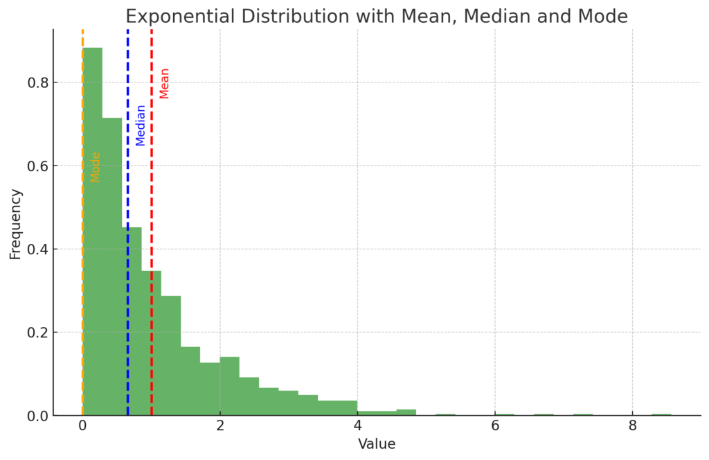
The plot above shows an exponential distribution of a dataset (represented by the histogram), along with its mean (represented by the red dashed line), median (represented by the blue dashed line), and mode (represented by the orange dashed line).
In this skewed distribution:
- The mean (red line) is greater than the median and the mode, which is expected in a distribution with a long tail on the right.
- The median (blue line) is the middle value that separates the higher half from the lower half of the data. For skewed distributions, it is usually closer to the mode than the mean.
- The mode (orange line) is the value that appears most frequently in the dataset. For an exponential distribution, the mode is at the peak of the distribution, which is at the very beginning of the tail (the minimum value of the dataset).
This demonstrates that the mean, median, and mode are not necessarily equal for non-symmetric (e.g., skewed) distributions, and each measures a different aspect of the central tendency of the data.
Introduction to Normal Distribution
Exponential Distribution aside, in a Normal Distribution, these three measures coincide and are located at the peak of the distribution’s curve, which signifies that it is symmetric about the mean.
Why Normal Distribution is important
The normal distribution, often referred to as the Gaussian distribution, is a type of continuous probability distribution that is fundamental to statistics and data science. It is one of the most important and widely used distributions due to its descriptive ability for a large number of natural, biological, and social behaviors.
This distribution is particularly valuable because it models a multitude of natural phenomena and statistical processes with a high degree of accuracy.
For instance, it describes variables such as height, IQ scores, measurement errors, and light intensity.
Understanding the normal distribution and its properties is key to many areas of study, including but not limited to, physics, engineering, computer science, economics, biology, psychology, and any field that uses statistical techniques.
With the right Python code, you can conduct powerful statistical analyses.
Before we begin, in order to access the code from this tutorial, subscribe to the mailing list below:
Characteristics of Normal Distribution
The normal distribution is characterized by a bell-shaped curve, also known as the Gaussian function. It is symmetric about the mean, showing that data near the mean are more frequent in occurrence than data far from the mean.
The shape of the normal distribution is determined by: the mean (μ) and the standard deviation (σ).
- The mean (μ) determines the center of the distribution,
- while the standard deviation (σ) determines the height and width of the distribution.
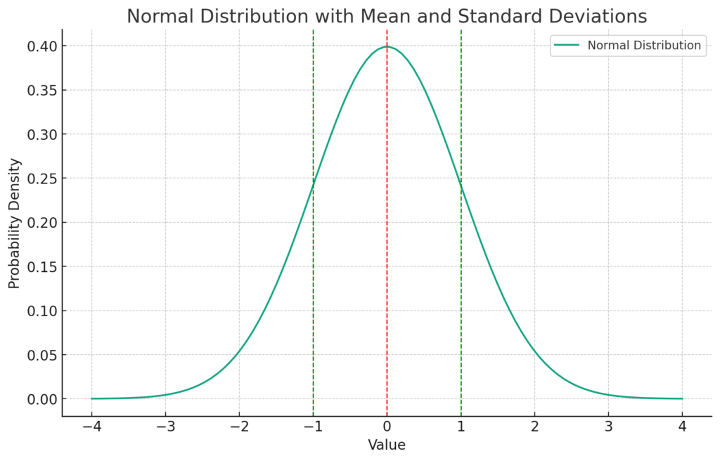
The plot above is a visual representation of a normal distribution.
- The blue curve represents the normal distribution (Gaussian function).
- The red dashed line shows the mean (μ) of the distribution, which is the center of the curve.
- The green dashed lines represent one standard deviation (σ) away from the mean on either side.
The mean, or average, is a measure of central tendency, meaning it represents a typical value for the data set. In a normal distribution, the mean, median, and mode are all equal and located at the center of the distribution.
Standard Normal Distribution
A normal distribution with a mean of 0 and a standard deviation of 1 is called a standard normal distribution.
If samples are normally distributed, it is likely that a random sample will have a value near the mean.
In fact, approximately 68% of all data samples fall within one standard deviation away from the mean (i.e., between -1 and +1 when the mean is 0). Following this, about 95% falls within two standard deviations, and about 99.7% falls within three standard deviations. This rule is known as the empirical rule or the 68-95-99.7 rule.

The plot above shows a standard normal distribution (mean = 0, standard deviation = 1) represented by the histogram and the black curve. The mean of the distribution is marked by the red dashed line, and the standard deviations are indicated by the blue, purple, and orange dashed lines.
- The blue lines represent one standard deviation away from the mean (-1 and +1). About 68% of the data falls within this range, according to the empirical rule.
- The purple lines represent two standard deviations away from the mean (-2 and +2). About 95% of the data falls within this range.
- The orange lines represent three standard deviations away from the mean (-3 and +3). About 99.7% of the data falls within this range.
This visualization illustrates the empirical rule (also known as the 68-95-99.7 rule) for a standard normal distribution.
Parameters of Normal Distribution
A key feature of the normal distribution is that it is entirely defined by its mean and standard deviation, meaning that if you know these two parameters, you can fully describe it.
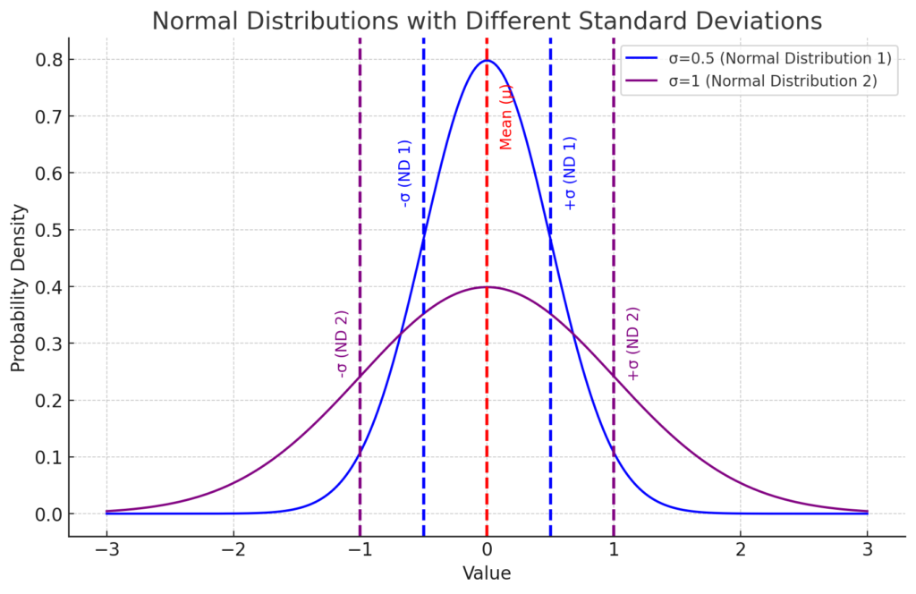
The plot above shows two normal distributions, both centered around the same mean (μ = 0), indicated by the red dashed line.
They however; have different standard deviations (σ).
For example;
- The blue curve represents a normal distribution with a standard deviation of σ=0.5 (Normal Distribution 1). The points that are one standard deviation away from the mean are marked by blue dashed lines.
- The purple curve represents a normal distribution with a standard deviation of σ=1 (Normal Distribution 2). The points that are one standard deviation away from the mean are marked by purple dashed lines.
As you can see, the standard deviation (σ) influences the spread of the distribution.
Remember that in a normal distribution, the points where the dashed lines (representing one standard deviation away from the mean) intersect with the solid line of the distribution, mark the bounds within which approximately 68% of the data lies.
This is split evenly between the left and right sides of the mean. This results in about 34% of the data existing on each side, up to these intersection points.
Therefore;
- A smaller standard deviation results in a distribution that is narrower and taller (blue curve),
- while a larger standard deviation leads to a distribution that is wider and shorter (purple curve).
Note that the mean (μ), marked by the red dashed line, could shift the entire distribution left or right along the x-axis, however as both distributions have the same mean (μ = 0), they are centered at the same point in these examples.
This visualization demonstrates that a full understanding of a normal distribution’s shape and location can be obtained with knowledge of just two parameters: the mean and the standard deviation.
The Central Limit Theorem and Normal Distribution
Additionally, due to the Central Limit Theorem, the normal distribution also holds a special place in statistics. The theorem states that, under certain conditions, the sum of a large number of random variables, each of which may be randomly distributed, will itself be approximately normally distributed, regardless of the shape of the original distributions.
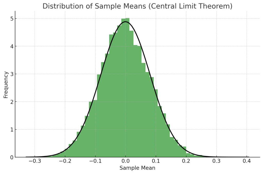
This plot demonstrates the Central Limit Theorem. The histogram represents the distribution of sample means from a population with a uniform distribution. Despite the original distribution not being normal, the distribution of the sample means approximates a normal distribution, as predicted by the Central Limit Theorem.
The black curve represents the expected normal distribution. As you can see, the distribution of the sample means (shown by the histogram) closely follows this curve, confirming the theorem’s prediction.
This demonstrates that even when we draw samples from a non-normal distribution, the distribution of the sample means tends to become normally distributed as the number of samples increases, which is a key point of the Central Limit Theorem.
Getting Started with NumPy and Matplotlib
Numerical Python, better known as NumPy, is a powerful library for numerical computing in Python. Among its many features, NumPy provides several functions that allow us to work with probabilities and NumPy’s random number generator (RNG).
Notably, it offers a simple and efficient way to generate random numbers that follow specific probability distributions, including the normal distribution.
In the rest of this tutorial, we will explore how to utilize NumPy’s functionality to generate normally distributed random numbers. We will delve into the concept of normal distribution, understand the significance of its parameters—mean and standard deviation—and how they affect the shape and location of the distribution. Subsequently, we’ll demonstrate how to use NumPy to generate random numbers under this distribution, and how these numbers can be applied in data analysis and statistical modeling.
This exploration will not only provide you with a solid understanding of the normal distribution and its application in Python using NumPy, but will also furnish you with a robust toolset for performing sophisticated statistical analysis and data modeling tasks.
In order to delve into the fascinating world of normal distribution and Python’s powerful NumPy library, you need to have NumPy and Matplotlib installed.
To do this you need to have Python Installed as well as an IDE such as PyCharm, if you havent done so already. Alternatively you can use Google Colab online via your Google account.
Once done you can install NumPy and Matplotlib using the following command:
python -m pip install --upgrade numpy matplotlib scipy
Here is a breakdown of the command:
python: This is the command to run the Python interpreter.-m: This flag specifies that the following argument should be run as a module.pip: This is the name of the package manager for Python. It is used to install and manage Python packages.install: This is the command for pip to install a package.--upgrade: will upgrade to the latest versions if you already have these installednumpy: This is the name of the package that pip will install. NumPy is a popular Python package for numerical computing.matplotlib: This is another package that pip will install. Matplotlib is a plotting library for Python.scipy: This is a third package that pip will install. SciPy is a library of scientific computing tools for Python.
How to Generate Normally Distributed Random Numbers with NumPy
NumPy provides a subpackage called numpy.random to handle random numbers. To work with random numbers, you should first create a default random number generator (RNG):
import numpy as np
rng = np.random.default_rng()
print(rng)
#>> Generator(PCG64) at 0x7F00828DD8C0
The RNG can generate random numbers from a variety of distributions. To extract samples from a normal distribution with custom mean and standard deviation, use the `.normal()` method:
print(rng.normal(loc=50, scale=5))
#>> 54.7267363999485851

print(rng.normal(loc=50, scale=5))
#>> 47.36319454706659285

print(rng.normal(loc=50, scale=5))
#>> 51.49721098751590947
In this example, the numbers generated appear random, with a mean (loc) of 50 and a standard deviation (scale) of 5. However, it is difficult to confirm that a small set of numbers are drawn from the specified distribution. You can resolve this by generating a larger set of samples at once:
samples = rng.normal(loc=50, scale=5, size=10000)
print(samples.mean())
#>> 50.016432134020854705
print(samples.std())
#>> 4.9974207086330512
Here, 10,000 normally distributed random numbers are generated with a mean of 50 and a standard deviation of 5. The calculated mean and standard deviation of the samples are close to the specified values, confirming the distribution.
Generating Multi-Dimensional Arrays with NumPy
NumPy allows you to create multi-dimensional arrays of random numbers. To generate such an array, you can specify the ‘size’ parameter using a tuple with the desired dimensions:
multidim_array = rng.normal(size=(3, 5))
print(multidim_array)
#>> array([[ 1.23857391, -1.14734804,  0.21289176,  0.86432461, -0.30998628],
#>>        [-0.17532731,  0.82363043,  0.08627196,  1.37422942,  0.4297013 ],
#>>        [ 1.146538  , -0.53965041,  0.43010234, -0.29028528, -0.85178233]])
In this case, you’ve created a two-dimensional array of normally distributed random numbers with three rows and five columns.
Using multi-dimensional arrays can be beneficial when modeling repeated experiments or organizing data in a structured manner. You’ll explore more practical examples of this concept later on.
How to Plot Normally Distributed Random Numbers with NumPy
In modeling scenarios, focusing on just one result is typically not insightful. Instead, it’s preferable to examine numerous samples to understand their overall distribution. One effective way to achieve this is by creating a histogram to visualize the distribution of your numbers.
For the first example, let’s use the numbers generated previously:
import numpy as np
rng = np.random.default_rng()
numbers = rng.normal(size=10000)
We can create a histogram with ten thousand numbers:
import matplotlib.pyplot as plt
plt.hist(numbers)
plt.show()
Executing plt.show() displays the histogram in a separate window, resembling the following:
In a histogram, values are organized into bins. In this example, the histogram has ten bins. The vertical axis indicates the number of samples within each bin. The histogram’s shape reveals characteristics associated with the normal distribution: symmetry, a single peak, and tapering sides.
To refine your visualization, you might want to increase the number of bins based on the sample size in your dataset. To do this, specify the bins parameter:
plt.hist(numbers, bins=50)
plt.show()
By increasing the number of bins to 50, the histogram becomes smoother:
Trying different bin quantities can impact the histogram’s appearance, so experiment with various options when exploring your data.
Having more bins results in fewer values per bin, rendering the y-axis absolute numbers less significant. The histogram’s area can be calculated by multiplying the number of observations by a bin’s width, which depends on the minimum and maximum observations and the bin count:
bins = 50
bin_width = (numbers.max() - numbers.min()) / bins
hist_area = len(numbers) * bin_width
print(hist_area)
#>> 763.8533882079863
While this value may not be inherently interesting, it can be helpful for comparing your histogram to a theoretical normal distribution.
The SciPy library offers several pdf() functions, representing probability density functions. These can be used to plot theoretical probability distributions:
import scipy.stats
x = np.linspace(-4, 4, 101)
plt.plot(x, scipy.stats.norm.pdf(x))
plt.show()
Using scipy.stats.norm.pdf(), the normal distribution is calculated for x values between -4 and 4, resulting in this plot:
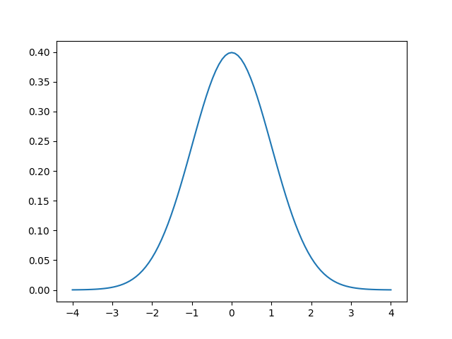
The symmetrical curve with a single peak is clearly visible. By definition, a probability density function’s area under the curve is one. To compare your histogram of observations to the theoretical curve, you need to adjust the scaling:
x = np.linspace(numbers.min(), numbers.max(), 101)
plt.hist(numbers, bins=100)
plt.plot(x, scipy.stats.norm.pdf(x) * hist_area)
plt.show()
Here, the probability density function is scaled by the histogram’s area, calculated earlier. The resulting plot displays the normal distribution overlaid on the histogram:
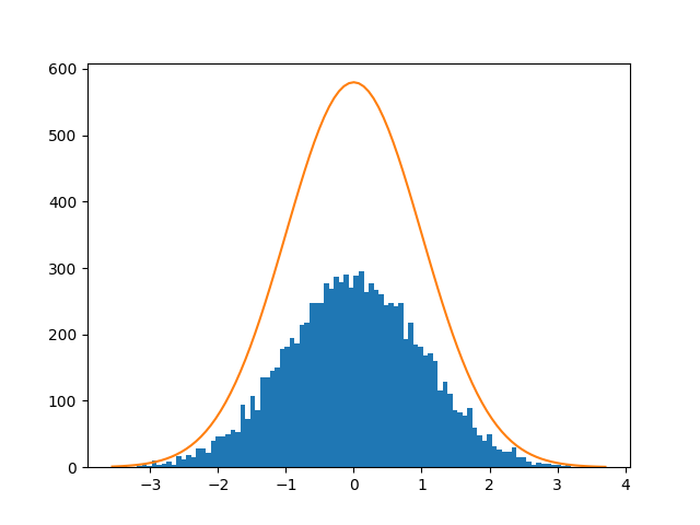
The probability density function of the normal distribution on top of a histogram of samples
Visual inspection reveals that the random data closely follows the normal distribution.
You’ve now seen how to work with the normal distribution using NumPy. The following sections will discuss the normal distribution’s significance and practical applications.
Define the Mean and Standard Deviation using NumPy
Real-world data like exam scores, blood pressure, and rainfall often follow a normal distribution.
Suppose you want to model the distribution of exam scores for a particular subject.
Based on historical data, you find that the average score is normally distributed with a mean (μ) of 75 points and a standard deviation (σ) of 12 points.
You can create a normal distribution with any mean (μ) and any positive standard deviation (σ). In NumPy, you do this by specifying two parameters:
import numpy as np
rng = np.random.default_rng()
scores = rng.normal(75, 12, size=5_000)
scores[:3]
print(scores[:3])
#>> array([84.86073839, 61.28029792, 88.35777162])
Now, your random values are mostly centered around 75. Calculate the mean and standard deviation of your observations:
mean = scores.mean()
print(mean)
#>> 74.95528123318711
standard_deviation = scores.std()
print(standard_deviation)
#>> 11.98237564380236
Your random numbers have characteristics close to their theoretical values, but not exactly equal. Visualize your data:
import matplotlib.pyplot as plt
plt.hist(scores, bins=50)
plt.show()
The generated plot should look like this:
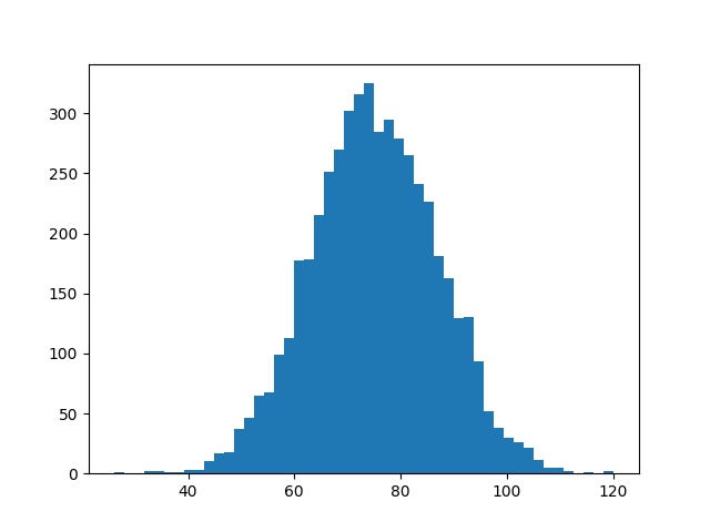
Observe the familiar shape of the histogram. The x-axis is centered around 75. Use NumPy to calculate the proportion of observations below 60 points:
proportion_less_than_60 = np.mean(scores < 60)
print(proportion_less_than_60)
#>> 0.106
NumPy computes a Boolean expression like scores < 60 element-wise. The resulting array contains True and False values depending on each exam score. Since True and False can be interpreted as 1 and 0, respectively, you can use mean() to calculate the proportion of True values.
In this example, 10.6% of the exam scores are below 60 points. You can estimate a similar number by examining your plot. The area under the curve to the left of x = 60 represents the students who scored below 60.
Now you’ve seen how to generate normally distributed numbers with a specific mean and standard deviation. In the next section, you’ll delve deeper into NumPy’s random number generator.
Working with Random Numbers in NumPy
Generating random numbers within a deterministic system like a computer is not a simple task. Most random number generators don’t create true randomness. Rather, they produce numbers through a deterministic and reproducible method, making the numbers appear random.
In general, a random number generator, or more accurately, a pseudo-random number generator (PRNG), is an algorithm that begins with a known seed and generates a pseudo-random number from it. One benefit of such a generator is its ability to reproduce the random numbers:
import numpy as np
rng = np.random.default_rng(seed=1789)
arr1 = rng.normal(size=3)
print(arr1)
#>> array([ 2.15300499 -0.63937701 -0.11751325])
rng = np.random.default_rng(seed=1789)
arr2 = rng.normal(size=3)
print(arr2)
#>> array([ 2.15300499 -0.63937701 -0.11751325])
rng = np.random.default_rng(seed=3076)
arr3 = rng.normal(size=3)
print(arr3)
#>> array([-1.00223169  2.35340131  1.22744585])
When you create a random number generator with a specific seed, you can recreate the same random numbers later by using the same seed. In this example, the second call to .normal() generates the same numbers as the first one. If you initialize the generator with a different seed, you get different random numbers.
In the past, NumPy users did not use an explicit random number generator when working with random numbers. Instead, they called functions like np.random.normal() directly.
However, NumPy 1.17 introduced explicit random number generators, and it is now recommended to use this updated method for working with random numbers as much as possible.
One advantage of the new approach is that it is more transparent. If you need random numbers in various parts of your program, you should pass the random number generator around.
To learn more about NumPy’s random number policy, you can refer to NEP 19, one of the NumPy Enhancement Proposals.
In the concluding section, you will revisit the normal distribution and discover more about why it is so widespread.
Understanding the Central Limit Theorem Through Iteration
The normal distribution has a significant role in statistics and probability theory. It appears in numerous practical examples and theoretical outcomes. The central limit theorem can help explain some of the underlying reasons.
The theorem states that the average of repeated experiments will approximate a normal distribution. One essential criterion for this to hold true is that the experiments have identical distributions, although they don’t need to be normally distributed.
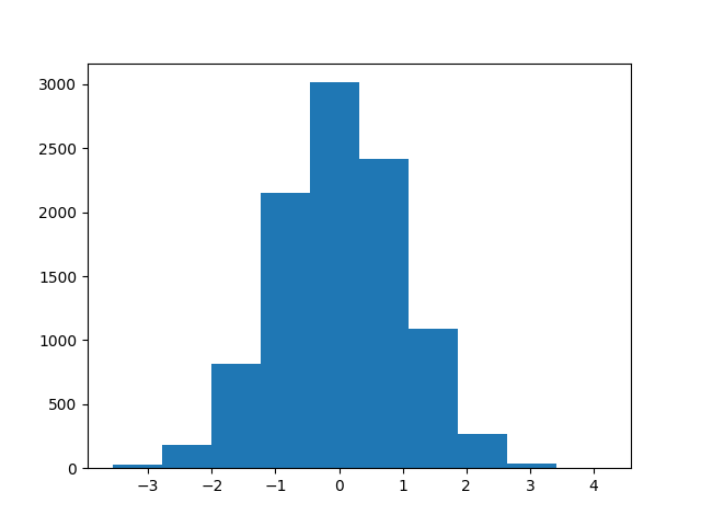
For a hands-on example, consider rolling a die. Regular dice have six faces, and in a single die roll, each of the outcomes—1, 2, 3, 4, 5, or 6—is equally likely. These rolls are uniformly distributed. However, the average of repeated dice rolls will still be close to normally distributed.
You can demonstrate this with NumPy. First, generate a random die roll:
import numpy as np
rng = np.random.default_rng(seed=1789)
arr1 = rng.integers(low=1, high=6, endpoint=True, size=1)
print(arr1)
#>> array([6])
You use `.integers()` and specify that you want to sample integers in the range 1 to 6, inclusive. Next, you can use `size` to simulate a distribution of repeated die rolls. Start by repeating the die rolls twice. To get a representative distribution, you perform ten thousand such repeated rolls:
rolls = rng.integers(low=1, high=6, endpoint=True, size=(10_000, 2))
You can use `.mean()` to calculate the average of the two rolls and then plot the histogram to look at the distribution:
import matplotlib.pyplot as plt
plt.hist(rolls.mean(axis=1), bins=21)
plt.show()
This will produce a plot that resembles a histogram of the distribution of the average of two dice rolls.
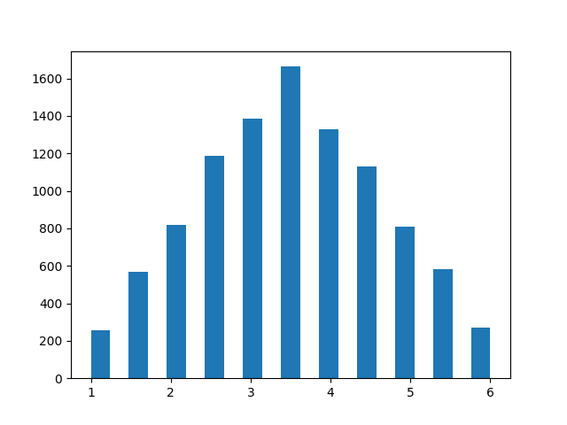
While the distribution is close to symmetrical and has a clear peak, you’ll notice that the shape is more triangular than bell-shaped.
Simultaneously, the distribution no longer shows uniformity, where each outcome would be equally likely.
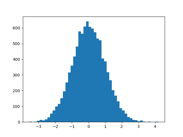
Next, try the same with ten repeated die rolls:
rolls = rng.integers(low=1, high=6, endpoint=True, size=(10_000, 10))
plt.hist(rolls.mean(axis=1), bins=41)
plt.show()
Now, the distribution is much closer to the familiar bell shape.
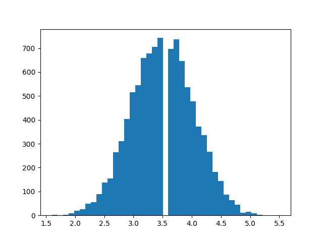
If you increase the number of repeated rolls, the distribution will get even closer to the normal distribution. This illustrates the central limit theorem: repeated experiments produce normality.
Since many natural processes include additive effects, they often follow the normal distribution quite closely.
Conclusion
Throughout this tutorial, you have explored how to work with normally distributed data in NumPy and visualize them using Matplotlib. The normal distribution is among the most prevalent probability distributions, and you have discovered how to visually compare your sample data’s distribution to the theoretical normal distribution.
The central limit theorem highlights one reason the normal distribution is found in various contexts. The average of repeated experiments gravitates towards normality.


